
Sudolabs
Software company rebranding
Corporate and startup accelerator · strategy, identity and digital for startups

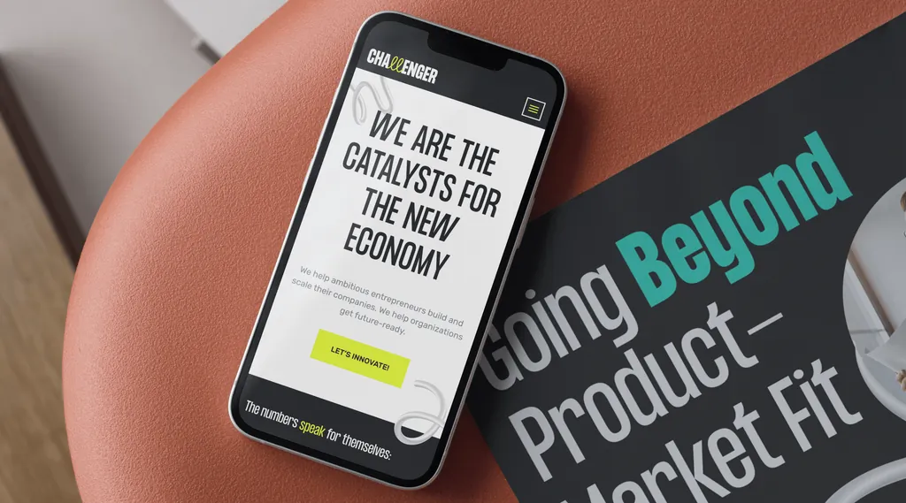
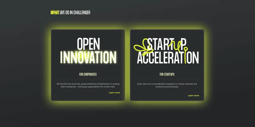
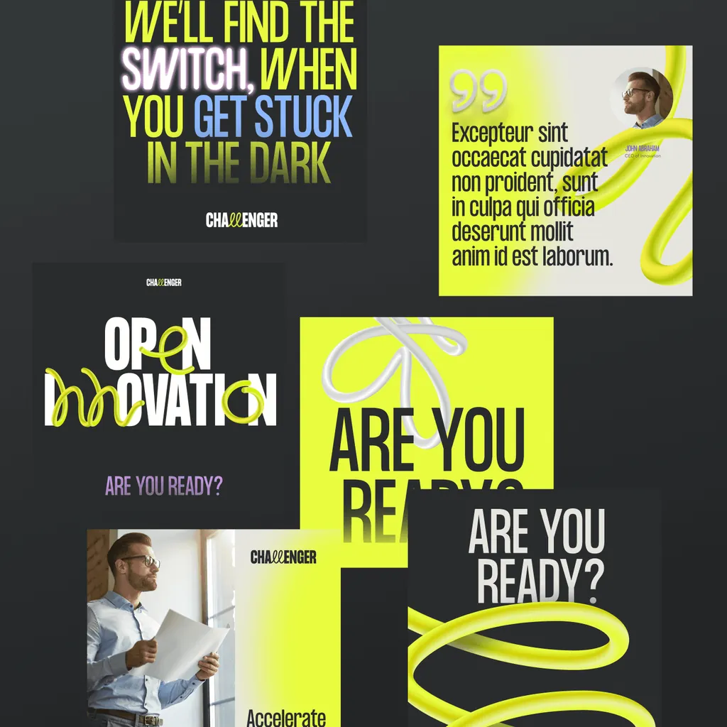
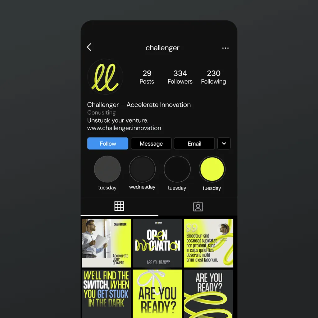
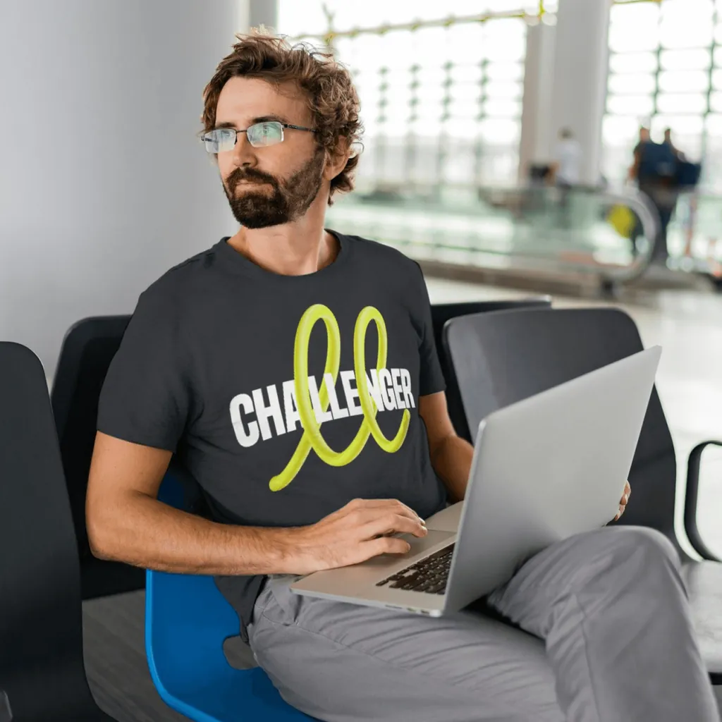
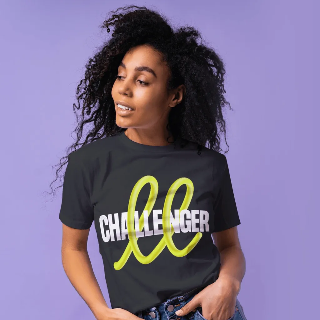
A loop as the “innovation touch” that loosens rigid corporations: the new identity for Challenger, a Slovak accelerator for startups and large companies. We designed the identity, website and social media.
This identity bridges their dual focus: bringing fresh innovation impulses to large corporations and continuing to support the Slovak startup ecosystem through accelerator programs.
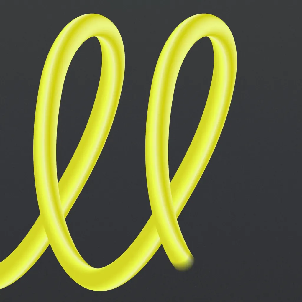
At the heart of the design is the dynamic spring or “loop,” symbolizing the “innovation touch” needed to disrupt the rigidity of large corporations. The interplay between the fluid loops and structured geometric typography serves as a metaphor for the challenges corporations face when seeking innovation: their structured, often rigid systems are revitalized by light, dynamic touches of creativity.
The tagline, “We’ll find the switch when you get stuck in dark,” embodies their mission. Vibrant loops and glowing elements on dark backgrounds reinforce this message, crafting a visual identity that speaks to flexibility, adaptability, and forward-thinking.

Software company rebranding
Empowering a resilient future
The smarter way to do drinks business
Tell us what you're making. A few sentences are enough.
Every project starts with a free 30-minute call. You get a quote after it.
Prefer email? hello@moredesign.studio