Kvetináreň
Artisan flower shop
Brand identity update for a Mexican experience restaurant · strategy and identity for founders

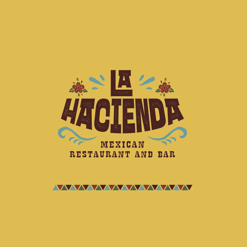
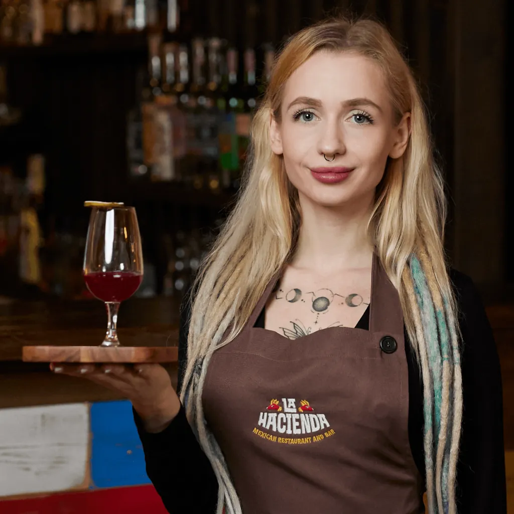
Evolution, not revolution: a brand strategy and refreshed identity for La Hacienda, a Mexican restaurant in Košice, built around La Luz, an alebrije character. We refined the existing logo and built one design system for digital, video, print and the interior.
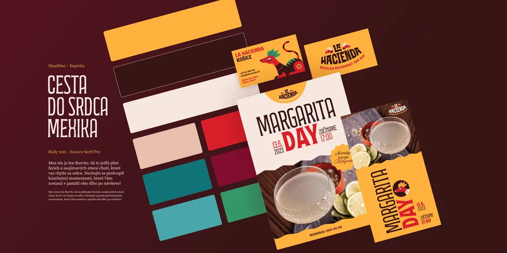
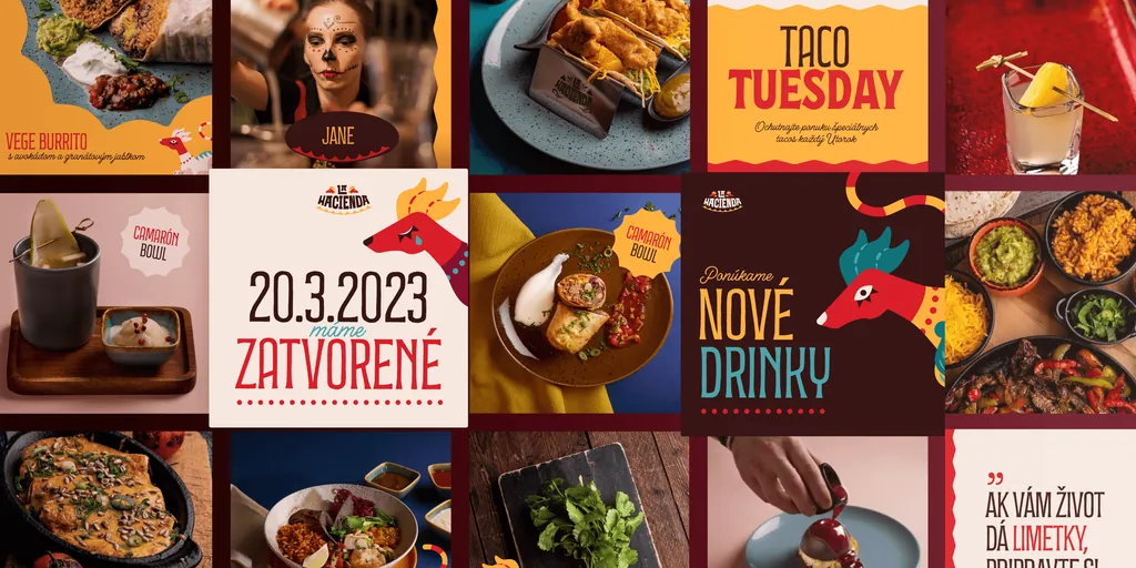
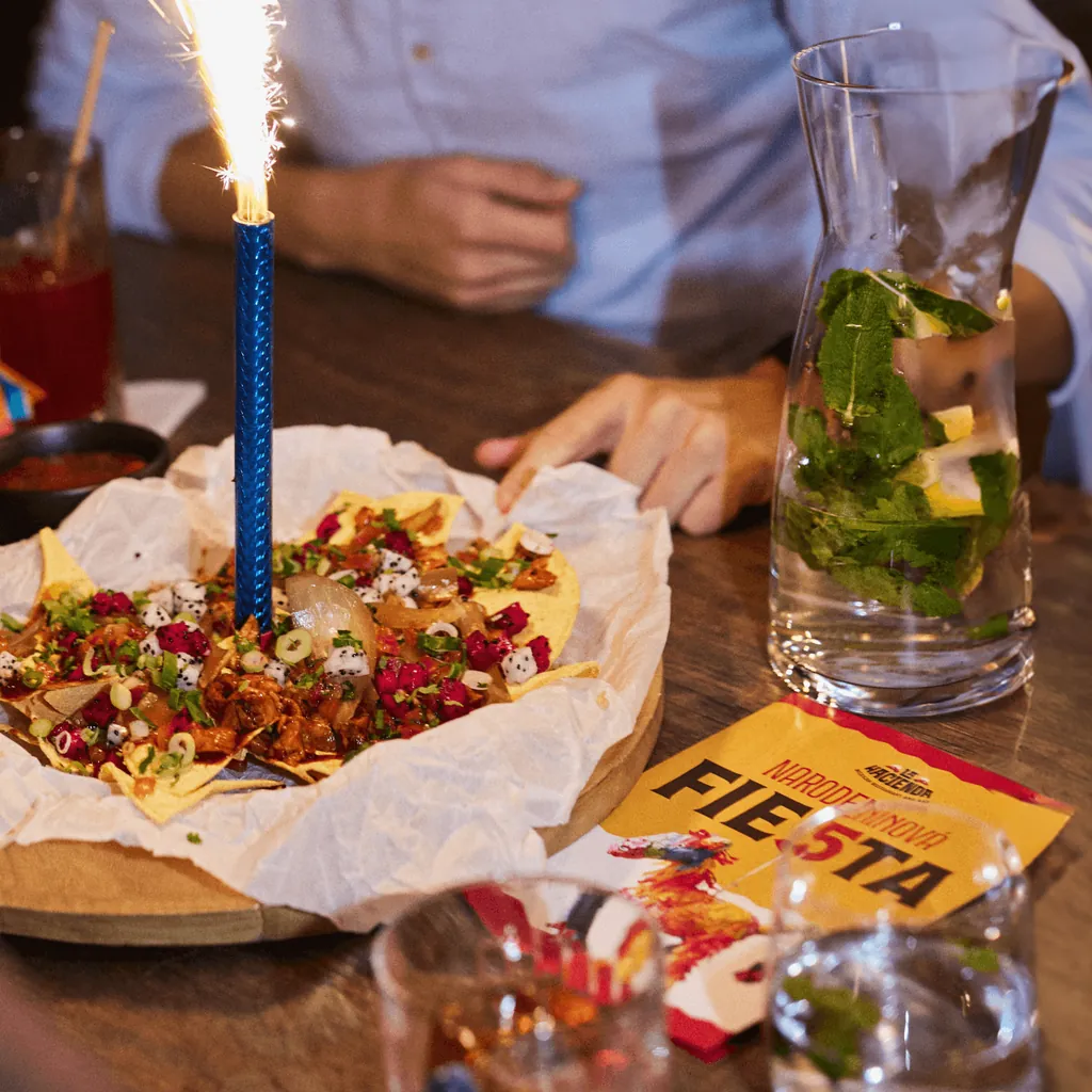
The updated design system was crafted to ensure consistency across various formats, including digital platforms, video, print, and even the restaurant’s interior.
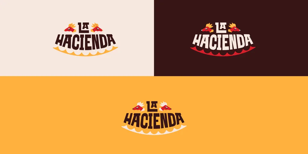
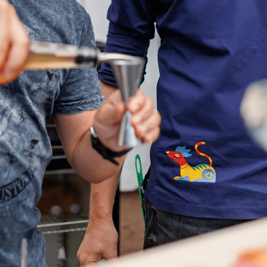
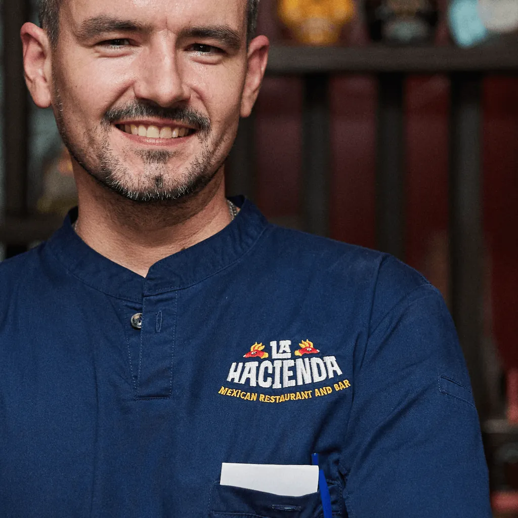
At the heart of the concept is “La Luz,” an “alebrije” character that embodies the restaurant’s vibrant spirit and helps tell its unique story. A key challenge was refining the existing logo to improve usability and contrast across small formats and animations while maintaining its original essence. Subtle adjustments to the logo’s geometry enhanced its versatility and integration into the broader design system.
La Hacienda is a prime example of evolution, not revolution, in brand communication. ¡Salud!
Our rebranding checklist:
• Unique brand font
• Signature color(s)
• Digital brand elements translated into the physical space
• Print and merchandise-friendly design system
• Emotionally expressive visual language tied to the guest experience
• Creation of a brand personality
• Retention of the brand name and core logo elements
• Transferable design system across multiple locations
• Canva-ready design
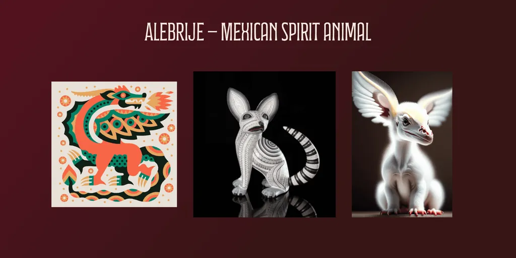
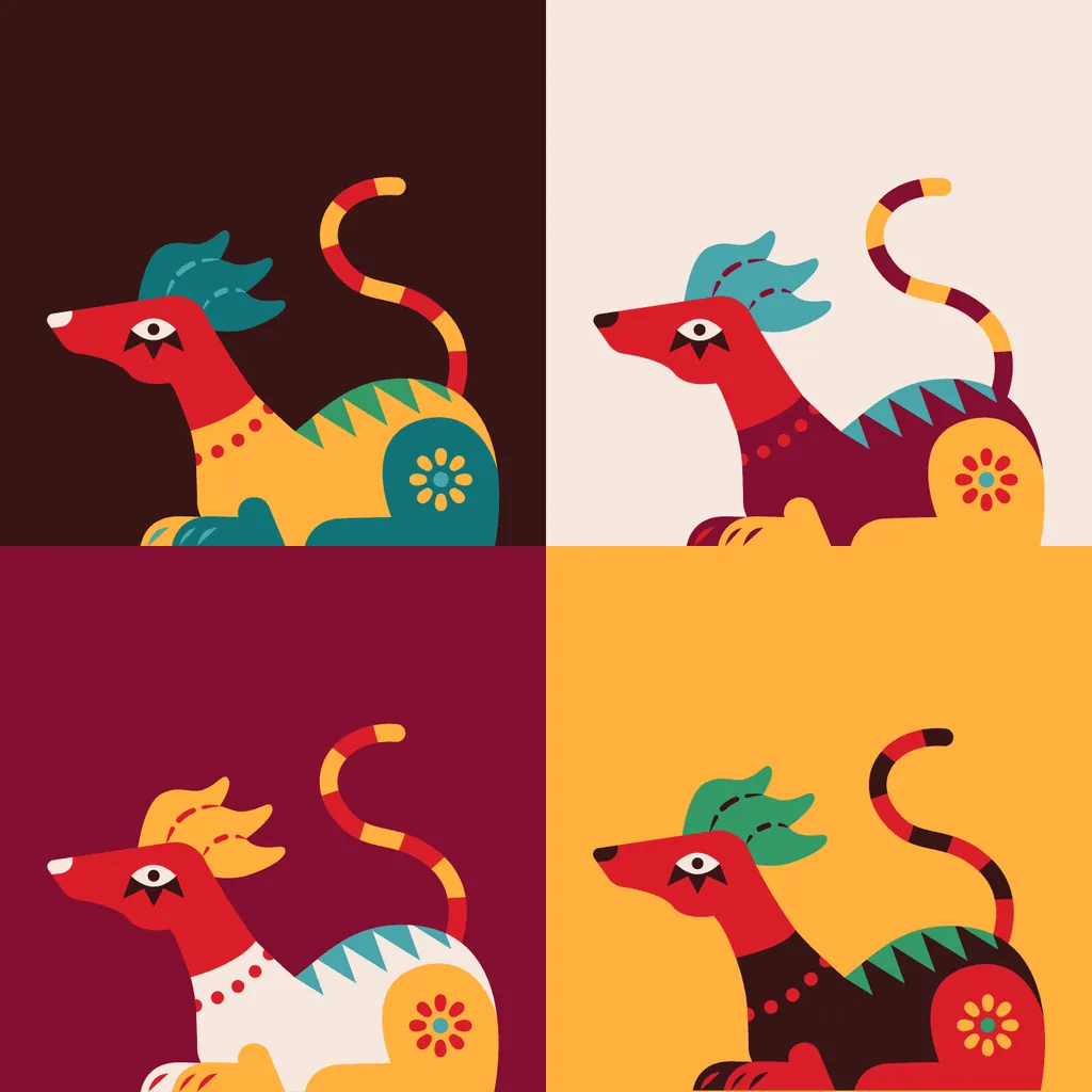
La Luz, our Alebrije, represents the inner light that shines within each of us. With its vibrant and radiant colors, La Luz is a symbol of hope, inspiration, and positivity. According to legend, La Luz guides those who seek clarity and enlightenment.
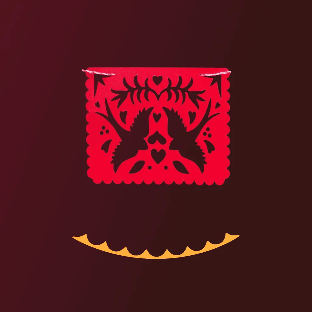
Inspired by the art of Papel Picado, our design element captures the festive and joyful spirit of Mexican culture. With its intricate, colorful patterns, it represents the celebration of life, connection, and community. Just like the delicate cuts of Papel Picado, this element serves as a reminder that beauty can be found in even the smallest details, bringing warmth and vibrancy to the world around us.
Artisan flower shop

United by wine
Construction company rebranding after 30 years
Tell us what you're making. A few sentences are enough.
Every project starts with a free 30-minute call. You get a quote after it.
Prefer email? hello@moredesign.studio